TRURO


PROJECT DETAILS
Truro is a vibrant town that is socially connected, environmentally conscious and prosperous. It is a place where both local residents and visitors to the region enjoy nature, heritage and a great rural lifestyle. We worked in close consultation with the Truro & District Community Association and the local community to create a brand that better represented the qualities of the township and provided a more modern appeal for both tourists and locals.
The new Truro brand aims to position the town as an attractive destination for visitors to take a break, camp out under the stars, and experience the natural beauty and heritage of the region.
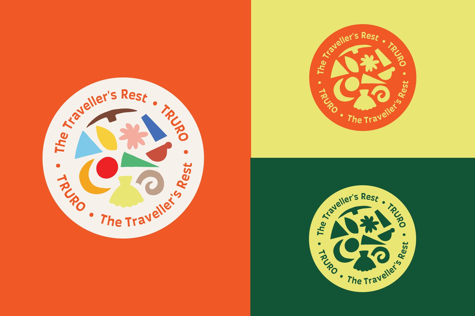
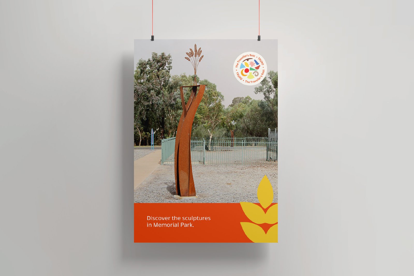
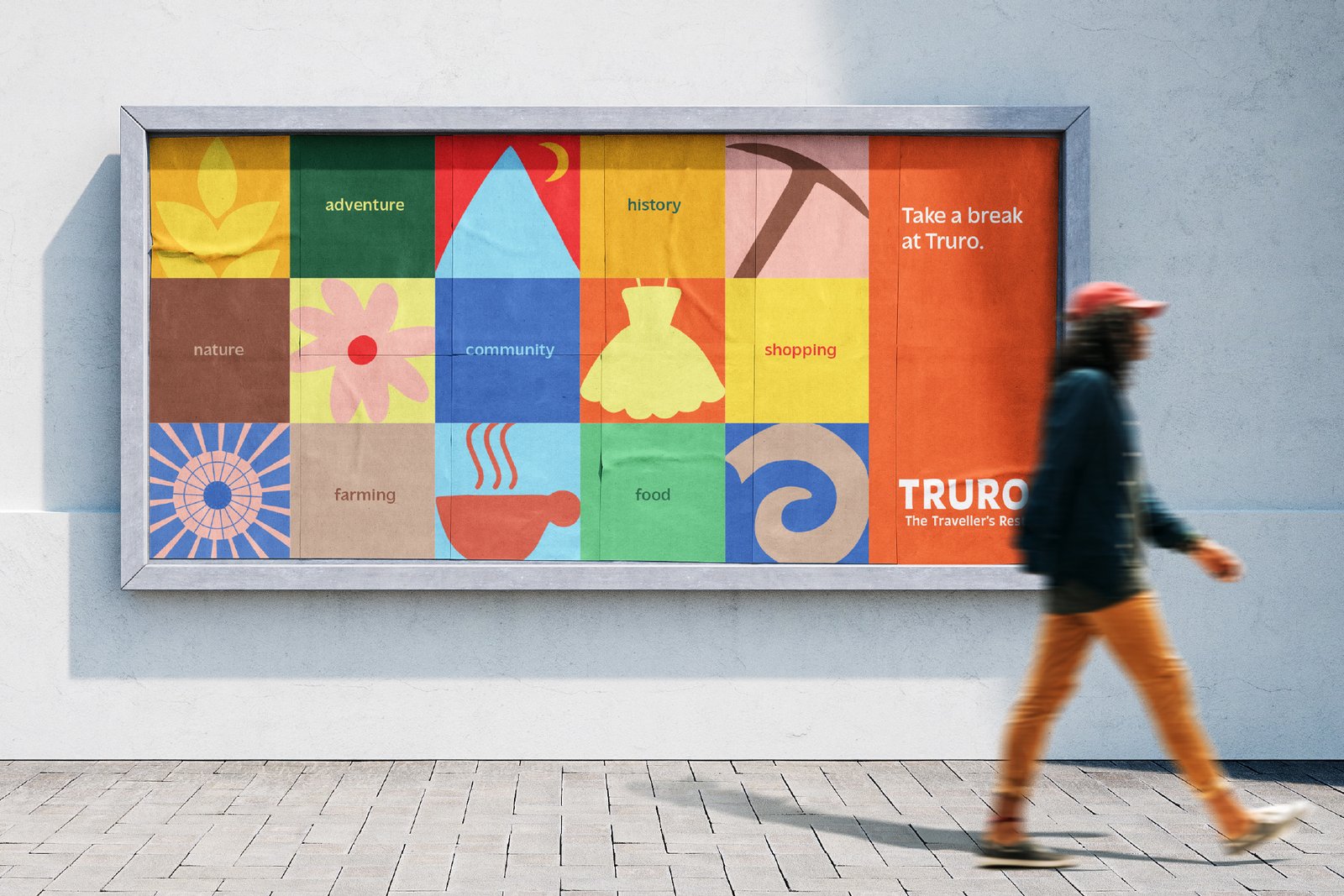
Drawing from the original Truro logo and inspired by the corten steel sculptural pieces displayed in Pioneer Park, the branding features a set of icons, each representing an aspect of Truro in a modern-style. While being abstract in nature, the icons maintain the history of the town and the well-known elements that have always represented Truro. The typography is confident and quirky, yet comfortable to read; a distinctive font that stands out from the crowd. The core colours are bold and bright, with the extended colour palette embodying the collaborative and diverse character of the town. Logo variations allow for flexibility of the branding; the more informative or more imaginative tones may be accented through selection of logo and colour palette.
CLIENT
Truro & District Community Association
INDUSTRY
Community
SERVICES
- Brand Identity
- Marketing Strategy
- WordPress Website Design
